Operation Joy is a heartfelt initiative dedicated to uplifting lives through simple yet impactful acts of kindness. From community events and wellness programs to surprise gestures of support, the brand embodies the mission of bringing light, hope, and happiness into everyday moments.
Design Objectives:
- Capture joy, warmth, and emotional upliftment in a bold yet friendly manner.
- Establish an approachable, dynamic identity that resonates with people of all ages.
- Create a highly visible, instantly recognizable logo adaptable for both digital and real-world activation’s.
- Represent “joy” through simplicity and smart visual play, without overcrowding the design.
Logo Concept & Creative Thought:
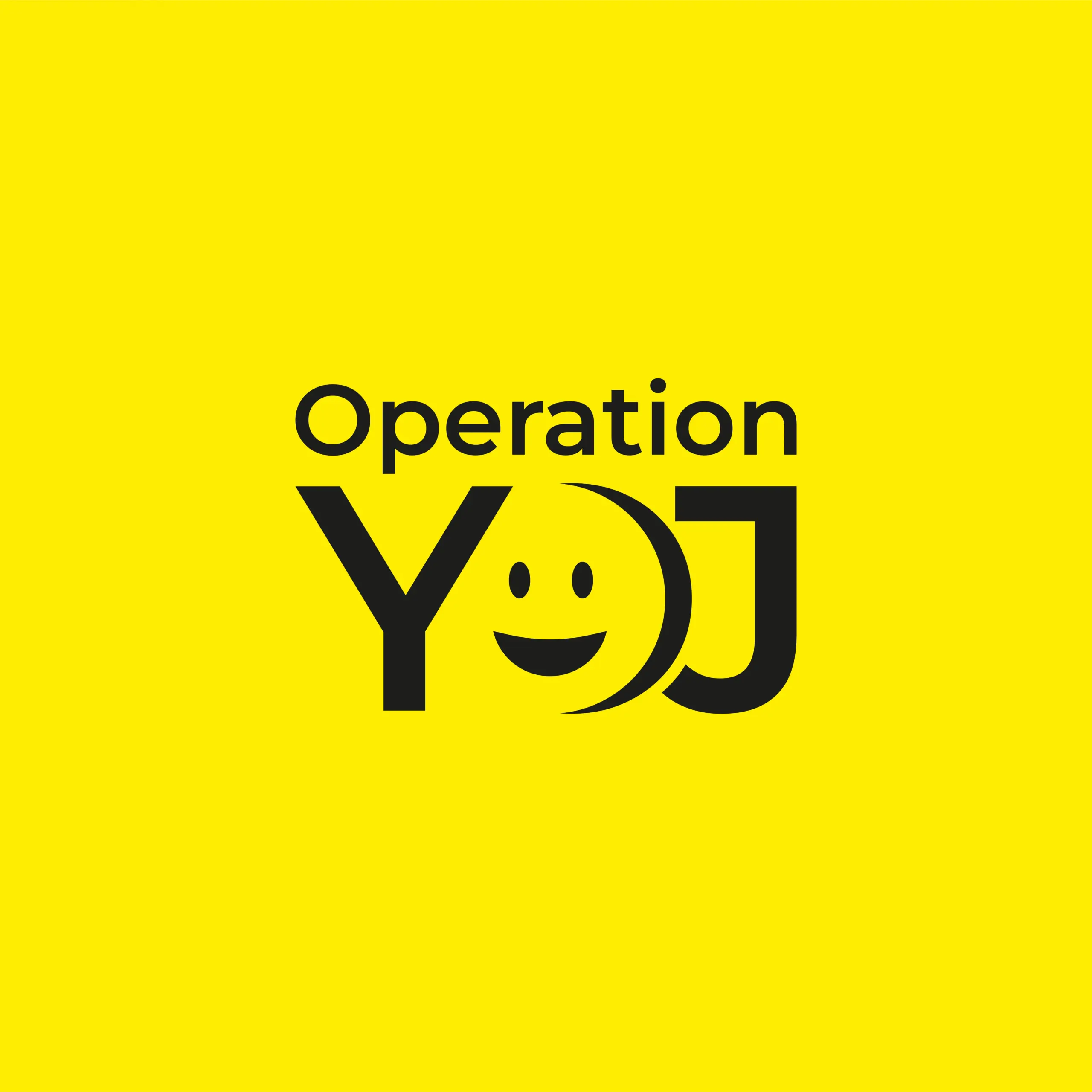
1. Symbol:
- The logo integrates a smiley face directly into the “O” of “JOY” (arranged in a unique “YOJ” layout).
- This playful twist makes the logo human, friendly, and engaging at first glance.
- The smile symbolizes positivity, connection, and emotional upliftment, turning typography into a living, joyful symbol.
Result: A logo that radiates happiness through clever simplicity, eliminating the need for additional decorative elements.
2. Typography:
- A bold geometric sans-serif typeface ensures clarity and strength.
- The straight, confident lines create a strong foundation, while the smile element softens the look, balancing professionalism with playfulness.
- The design is kept clean, with no curves or playful bouncing letters, but the smiley within the “O” provides all the necessary character and warmth.
3. Color Palette:
- Vibrant Yellow Background: A universal symbol of happiness, energy, and optimism.
- Jet Black Typeface: Ensures strong contrast, maximum legibility, and modern appeal.
- This stark two-tone palette amplifies visibility across all mediums, keeping the message direct and joyful.
Brand Message:
“Where kindness becomes a movement.”
Operation Joy is not just a name — it’s an invitation to spread smiles, support, and happiness, one thoughtful act at a time.
Brand Identity & Voice:
- The logo speaks to exclusivity and approachability — it’s simple enough for universal understanding, yet emotionally impactful.
- Its geometric precision with a human touch reflects the initiative’s focus on structured, intentional acts of kindness that bring authentic joy.
- The visual metaphor is clear: Operation Joy is a smiling ally in every community effort.
Applications:
- Eye-catching on event banners, merchandise, volunteer shirts, and community joy kits.
- Perfect for app icons, social media avatars, and digital campaign graphics
- Versatile enough for stickers, greeting cards, and surprise acts of kindness packaging.
- Highly visible in public activation’s such as pop-up joy booths or mobile kindness caravans.