Nortex Construction Group is a premium construction and infrastructure company known for its commitment to quality craftsmanship, durability, and trust. The challenge was to design a logo that communicates stability, bold leadership, and architectural expertise while still looking modern and professional.
We aimed to create a visual identity that resonates with both commercial and residential clients — something strong, minimal, and timeless.
Design Goals:
- Portray strength, structure, and professionalism
- Reflect the company’s role in large-scale construction and planning
- Ensure a logo that’s scalable across everything — from site signage to business cards
- Stand out in a crowded market with a memorable, no-nonsense design
Design Approach:
1. Concept & Direction:
We explored architectural forms, structural lines, and geometric layouts. The name “Nortex” led us toward directional symbols (North) and grid-based stability — combining them with visual cues from beams, columns, and engineered shapes.
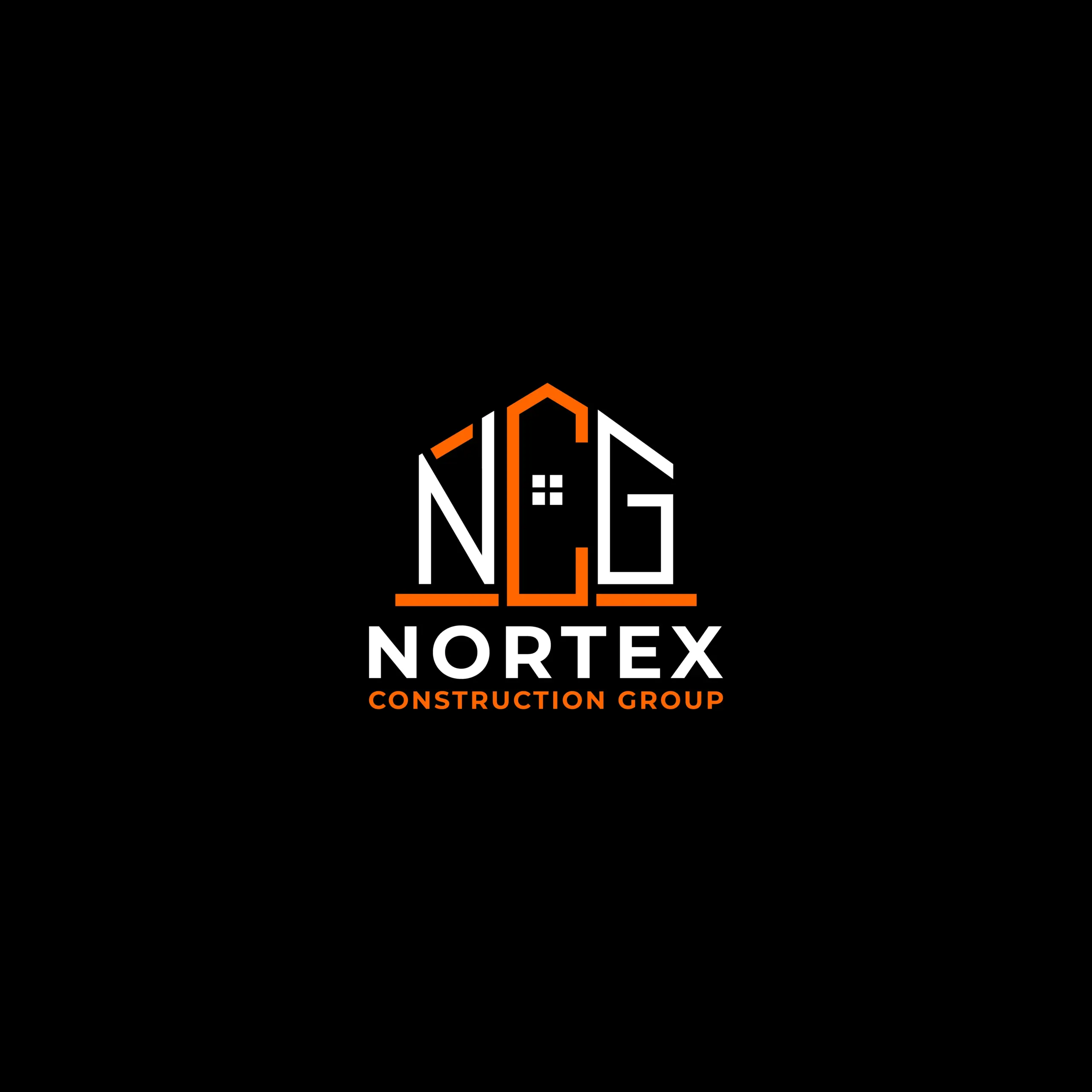
2. Logo Mark Design:
The icon creatively merges the letters “NCG” into the shape of a house, using bold, structured lines that hint at construction framing. The design captures strength, precision, and reliability — reflecting the essence of a trusted construction group.
3. Typography:
We’ve chosen a bold, custom sans-serif typeface that feels industrial and confident. Its clean lines and sharp edges ensure strong readability and visual balance — reinforcing a sense of strength and dependability for the brand.
4. Color Palette:
The palette uses a bold combination of black, white, and construction orange. This high-contrast scheme reflects strength, clarity, and confidence — perfectly suited for a modern construction brand that values professionalism and impact.
Where It Works
- Construction site banners, helmets, and uniforms
- Trucks, vans, and heavy equipment branding
- Company documents, contracts, and letterheads
- Real estate development proposals and investor decks
Why This Logo Stands Out:
- Embodies durability and growth
- Monogram design is recognizable and versatile
- Creates a strong visual identity for commercial use
- Designed to scale perfectly across print and large-format signage
Brand Statement:
The Nortex Construction Group logo is more than just a visual — it’s a foundation. Built with strategy, precision, and modern aesthetics, it mirrors the company’s unshakeable integrity and structural excellence in every project it undertakes.
Mockup Suggestions:
- Branded hard hat and site vest
- Company pickup truck or crane with logo
- Business card on industrial background
- Blueprint cover or proposal binder with debossed logo