Hanger Property Group is a real estate brand that blends professionalism with a strong sense of place. Our aim was to create a logo that feels grounded, trustworthy, and visually iconic within the real estate market.
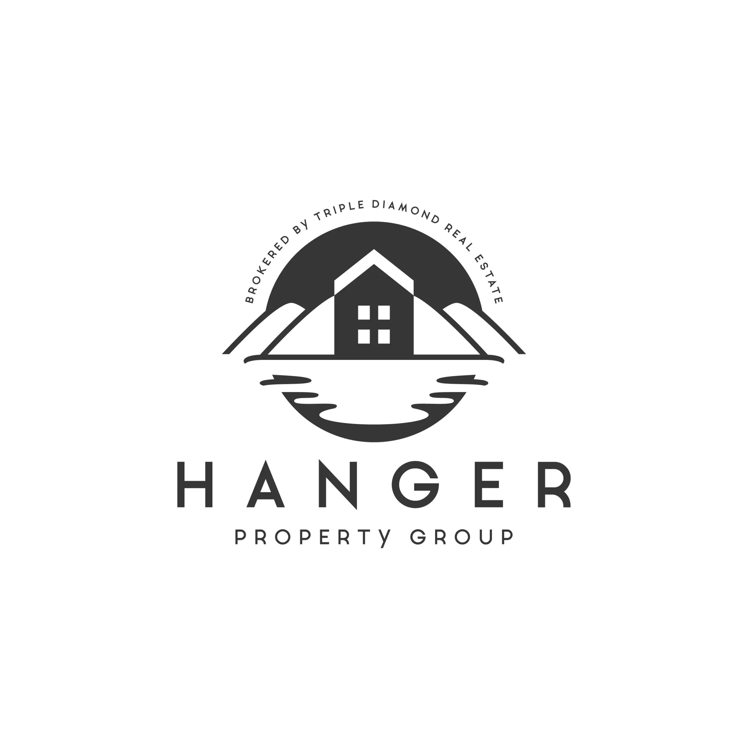
The design features a house at the center, framed by mountain peaks and a mirrored water reflection—symbolizing balance, stability, and a connection to the natural landscape. The clean lines and monochrome palette reflect sophistication and clarity, making it adaptable across signage, digital platforms, and print materials.
Design Process:
1. Research & Discovery:
We explored the real estate industry and studied the emotional impact of home ownership, safety, and natural landscapes. Inspiration came from the harmony between architecture and environment—key to Hanger Property Group’s identity.
2. Sketching & Concept Building:
We developed sketches combining rooftops, scenic landscapes, and structured symmetry to communicate trust, professionalism, and tranquility. The use of reflection and balance became a strong visual anchor.
3. Typography & Symbolism:
The typography is clean and contemporary, with spacious letter-forms that enhance clarity and elegance. The logo icon features a house nestled between mountains, reflected in water—symbolizing stability, depth, and peaceful living.
4. Color Palette:
We used a timeless black-and-white palette to create a high-end, minimal aesthetic. This approach works across all mediums—whether for print, signage, or digital assets.
Application & Versatility:
- Ideal for signage, yard boards, and property brochures
- Scales clearly for online listings and mobile platforms
- Elegant enough for letterheads and branded merchandise
- Remains impactful in single-color formats
Why This Logo Works
- Symbolically grounded in real estate and nature
- Strong visual identity for trust and expertise
- Balanced composition reflects harmony and professionalism
- Versatile for both premium residential and investment properties
The Hanger Property Group logo speaks of home, trust, and lasting value—making it the perfect visual identity for a forward-looking real estate brand.