In today’s digital world, you might think business cards are outdated—but think again. A well-designed business card is still a powerful networking tool that leaves a lasting impression. It represents your brand, communicates professionalism, and can even lead to new opportunities.
But not all business cards are created equal. Many professionals make critical design mistakes that can ruin their impact. So if you want your card to be memorable for the right reasons, here are five common business card design mistakes to avoid.
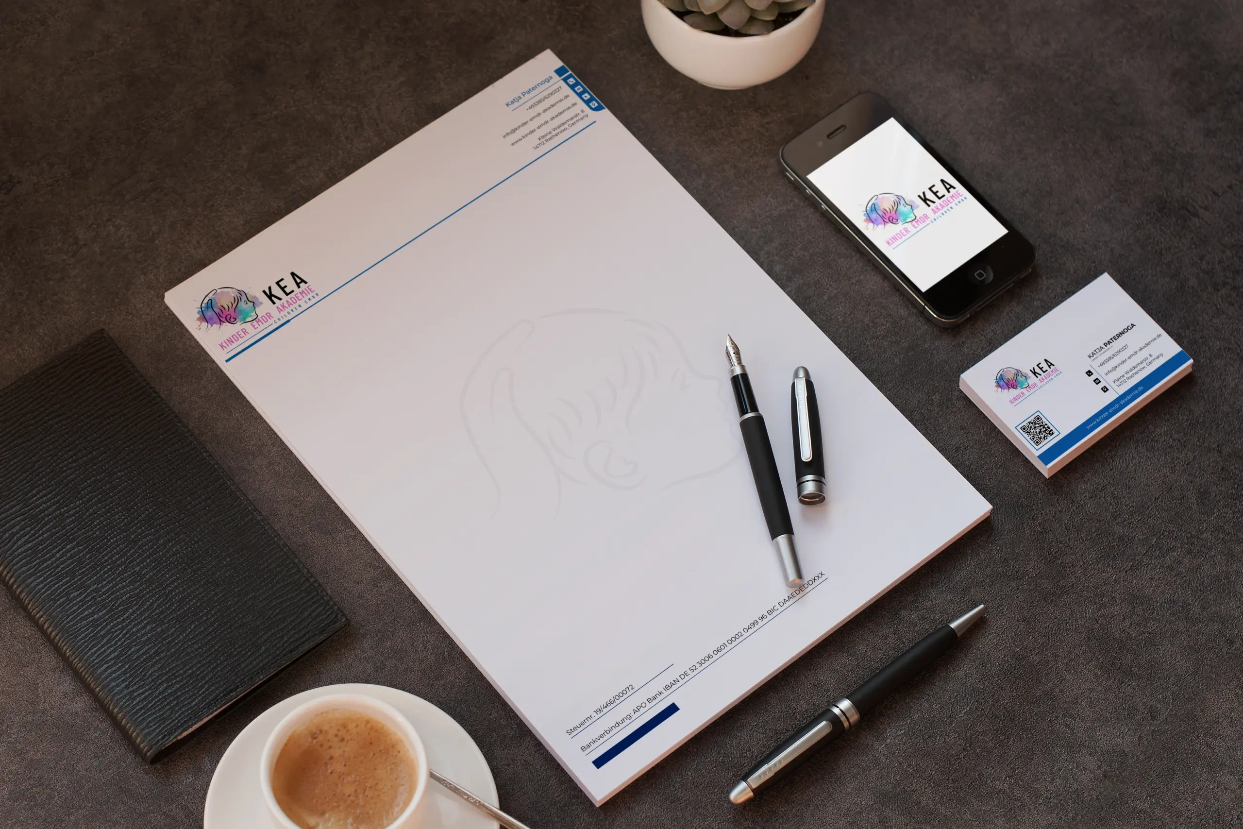
1. Cluttered or Overloaded Design
Mistake: Trying to fit too much information, design elements, or effects into a small space.
Why It’s a Problem: Business cards have limited real estate. Overcrowding the card with logos, QR codes, social media links, multiple fonts, and images can overwhelm the viewer and dilute your brand message.
Solution: Keep it clean and focused. Stick to essentials—your name, title, contact info, and logo. Use white space strategically to give the design room to breathe.
2. Poor Font Choices or Illegible Text
Mistake: Using overly decorative fonts, too many font styles, or text that’s too small to read.
Why It’s a Problem: If someone has to squint or guess what your card says, it fails its purpose. Typography directly affects the clarity and professionalism of your brand.
Solution: Choose clean, easy-to-read fonts and maintain a clear hierarchy (e.g., name bigger than title). Keep font size at least 8–10pt for body text.
3. No Clear Branding
Mistake: Designing a card that doesn’t reflect your brand’s identity or visual style.
Why It’s a Problem: A business card is a branding tool. If it doesn’t match your website, logo, or overall brand feel, it creates confusion and inconsistency.
Solution: Use your brand colors, logo, and typeface consistently. The design should feel like an extension of your brand, not a random template.
4. Ignoring Print Specifications
Mistake: Designing without considering bleed areas, safe zones, or print resolution.
Why It’s a Problem: A beautiful digital design can turn into a messy print job if print specs are ignored—resulting in cut-off text, pixelated images, or mismatched colors.
Solution: Design in CMYK color mode, use 300 DPI resolution, and follow print guidelines. Always include bleed (usually 3mm) and keep critical elements inside the safe zone.
5. Using Low-Quality Materials
Mistake: Choosing flimsy paper or low-quality print services to save money.
Why It’s a Problem: Your card is a tactile experience. Cheap material can make your brand feel less credible or professional.
Solution: Invest in high-quality cardstock (300gsm or above) and consider premium finishes like matte, glossy, spot UV, or embossing to elevate your brand presence.
Bonus Tips
- Add a unique touch: Use custom shapes, edge painting, or foil accents to stand out.
- Double-sided design: Use the back of the card for a tagline, QR code, or visual pattern.
- Proofread everything: Spelling errors or outdated contact info = instant deal-breaker.
Conclusion
Your business card is often your first impression—and you don’t get a second chance at that. Avoiding these common design mistakes will help you create a card that not only looks great but also works as an effective branding tool.
At Jiyan Infographic, we specialize in designing elegant, strategic business cards that capture your brand essence while making a bold impression.
👉 Need a stunning business card that speaks for your brand?