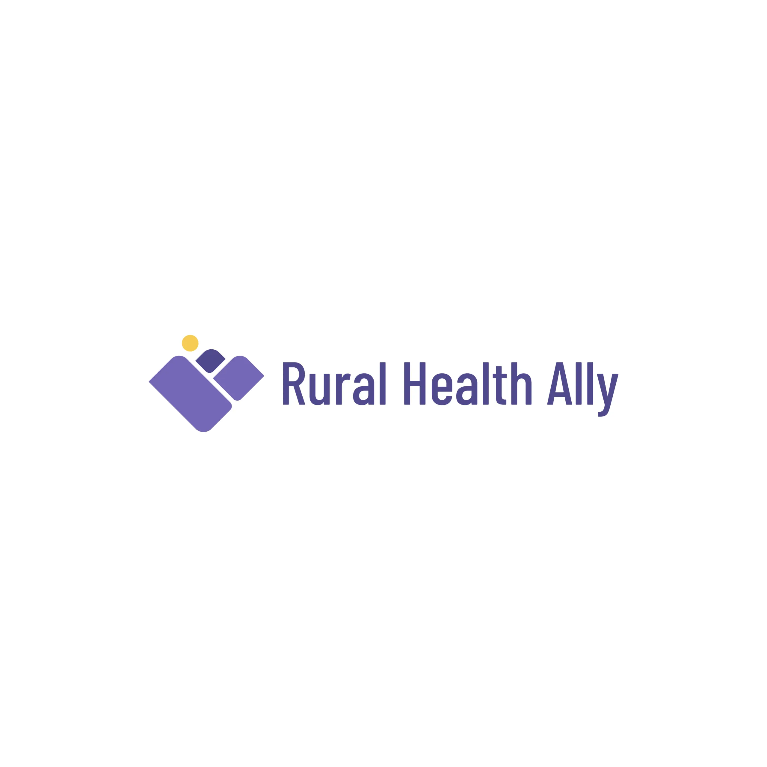
Rural Health Ally is a healthcare initiative dedicated to reaching rural communities with compassion, trust, and unwavering support. The brand stands as a true “ally” — helping bridge the gap between essential healthcare and remote areas. The logo needed to embody accessibility, groundedness, and a deep connection to nature and community landscapes.
Design Objectives:
- Reflect strength, stability, and support — as a reliable healthcare partner.
- Visually tie into rural landscapes — symbolizing outreach into remote terrains.
- Maintain a modern yet warm and approachable aesthetic.
- Ensure clarity and adaptability across digital platforms and field operations.
Logo Concept & Creative Thought:
1. Symbol:
The icon features geometric mountain-like forms stacked in an abstract arrangement, with a yellow dot above symbolizing the rising sun — a representation of hope, new beginnings, and guidance. The mountain imagery reflects the brand’s dedication to overcoming barriers and reaching even the most remote locations. Its simplicity lends a sense of solidity and approachability, ensuring the visual identity remains strong yet uncluttered.
2. Typography:
A clean, sans-serif typeface complements the geometric icon, emphasizing clarity, professionalism, and accessibility. The slightly rounded letterforms add a welcoming and friendly tone, making it well-suited for community healthcare communication. Balanced spacing ensures excellent legibility across both small-scale and large-scale applications.
3. Color Palette:
The soft lavender-purple represents care, wellness, and calmness — a contemporary choice that stands out from typical medical blues. Complemented by a golden yellow accent, which signifies hope, vitality, and the rising sun, the palette brings warmth and optimism. Overall, the minimal color scheme ensures adaptability across various platforms while maintaining a fresh and trustworthy vibe.
Brand Message:
“Your Health. Your Ally. No Matter How Far.”
Rural Health Ally stands not just as a healthcare provider but as a dedicated partner who journeys with rural communities, ensuring quality care reaches every individual.
Symbolism Breakdown:
- Mountains = Overcoming distance and challenges in healthcare access.
- Sun/Dot = Hope, guidance, and new beginnings.
- Geometric Simplicity = Modern, reliable, and professional approach.
- Soft Purple + Yellow = Balance of medical trust with human warmth.
Applications:
- Branded on mobile health units, field kits, uniforms, and community health reports.
- Adaptable across apps, telehealth platforms, and outreach campaigns.
- Effective on social media, infographics, educational content, and wellness workshops.


